Bevésett nevek (Carved Names), vol. 2


Photo: Lead82 Budapest. Villányi Csaba/Flashback Photo. License: All Rights Reserved. Artwork by Lead82 Budapest.
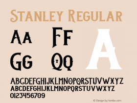
On 14 November 2014, aStanley, an adaptation of Times New Roman released by the Swiss Optimo Type Foundry in 2012, is applied in the book.
The unusual approach at first sight is the conceptual manifestation of remembrance that characterises the whole project connected with the monument. The homogenized typography is a metaphor, which refers to the intention of destroying diversity — to the consistent practice of the Holocaust when state power sentenced all its discriminated citizens to the same fate without exception.
The names, dates and places of birth and death of the university's victims can be read in 9,454 characters in a ribbon-like manner of a total length of 200 metres on the walls of the university buildings. In a similar manner, the nearly one million-character-long flow of text in the volume of studies provides the sensation of reading which is both horizontal and elongated.
In a manner that breaks with tradition, footnotes are not separated from the body text. The notes printed in bronze color are inserted right where they appear, visually echoing the bronze strips in the mortar joints of the monument.
The ribbon-like lines become highlights, even in the apparent typographical homogeneity, while the parts of the body text have remained, yet the content has received a stronger meaning. The meticulous use of twenty-seven linear memento signs makes the reader aware of the Prussian-like system of layout rules which the designers created for the volume, but in which the text shapes itself into a coherent system. The soul of the book design is provided by these twenty-seven so-called "thread page pairs", which also represent the pictorial illustration of the black volume after omitting the photographs and graphic elements from the book.
More information on Behance.

Photo: Lead82 Budapest. Villányi Csaba/Flashback Photo. License: All Rights Reserved. Artwork by Lead82 Budapest.

Photo: Lead82 Budapest. Villányi Csaba/Flashback Photo. License: All Rights Reserved. Artwork by Lead82 Budapest.

Photo: Lead82 Budapest. Villányi Csaba/Flashback Photo. License: All Rights Reserved. Artwork by Lead82 Budapest.

Photo: Lead82 Budapest. Villányi Csaba/Flashback Photo. License: All Rights Reserved. Artwork by Lead82 Budapest.

Photo: Lead82 Budapest. Villányi Csaba/Flashback Photo. License: All Rights Reserved. Artwork by Lead82 Budapest.

Photo: Lead82 Budapest. Villányi Csaba/Flashback Photo. License: All Rights Reserved. Artwork by Lead82 Budapest.

Photo: Lead82 Budapest. Villányi Csaba/Flashback Photo. License: All Rights Reserved. Artwork by Lead82 Budapest.

Photo: Lead82 Budapest. Villányi Csaba/Flashback Photo. License: All Rights Reserved. Artwork by Lead82 Budapest.
-
 Cangji Fonts
Brand: 仓迹字库
Area: China

-
 JT Foundry
Brand: 翰字铸造
Area: Taiwan, China

-
 Handmadefont
Brand:
Area: Estonia

-
·千图字体
-
 HyFont Studio
Brand: 新美字库
Area: China

-
 Minrui Type
Brand: 敏锐字库
Area: China

- ·Amazon Releases Ember Bold Font for the Kindle
- ·Surabaya Beat by Beat Presser, Afterhours Books
- ·Bevésett nevek (Carved Names), vol. 2
- ·Antropofagia. Palimpsesto Selvagem
- ·Jim Nutt: Coming Into Character at Museum of Contemporary Art Chicago
- ·Make market-ready fonts with this 8 point checklist
- ·Ad for Vincebus Eruptum by Blue Cheer
- ·Food Not Bombs hypothetical redesign
- ·The Great Comic Book Heroes, by Jules Feiffer
- ·Japanese Typography Writing System


