


Make market-ready fonts with this 8 point checklist
 Fine tune your typefaces with this checklist
Whether you're making a new piece of kinetic typography or putting the finishing touches to a dynamic responsive typography set, there are a few criteria to tick-off before your font is ready to be unleashed onto the world. We've put together this checklist it eight important factors to ensure your typeface takes off.
01. Multiple weights and styles
All fonts come with regular and bold versions, but you can expand your font's appeal further by also including multiple weights beyond those basic options.
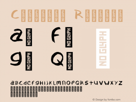
02. Glyphs
With obvious exceptions such as symbol fonts, all fonts should have complete glyph sets including accented letters and characters such as straight and curly quotes, currency signs and punctuation symbols.
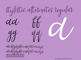
03. Alternate characters
Your fonts should ideally have features that allow them to be adapted in different ways, including ligatures, stylistic alternates, small caps and so on.
04. Spacing
The spacing between your letters should be neither too small, nor too large, both of which will make text difficult to read. play around with your design to ensure that you find the best, most proportionate spacing possible.
05. Functionality
No matter how beautiful your fonts are, no one will be interested unless they install properly in all common contexts: on both mac os X and Windows, in font menus in adobe and microsoft software, and so on.
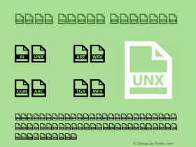
06. Multiple file types
Make sure you include a variety of file types, such as eps, ai, ttF, and otF, to ensure as many people as possible will be able to use your fonts.
07. Naming
Ensure that the name you give your font is original and won't be confused with others.
08. Originality
Run a check through MyFonts to discover whether your font is too close in appearance to any existing ones.
This article was originally published in Computer Arts magazine issue 250. Buy it here.


-
 Cangji Fonts
Brand: 仓迹字库
Area: China

-
 JT Foundry
Brand: 翰字铸造
Area: Taiwan, China

-
 Handmadefont
Brand:
Area: Estonia

-
·千图字体
-
 HyFont Studio
Brand: 新美字库
Area: China
-
 Minrui Type
Brand: 敏锐字库
Area: China


- ·Cocoa Marsh Instant Fudge Candy Mix packaging
- ·"Fantastic!" ad for Captain Fantastic & the Brown Dirt Cowboy by Elton John & Bernie Taupin
- ·Iconic Transport for London logo undergoes subtle redesign
- ·He Invented a Font to Help People With Dyslexia Read
- ·"David Bowie is turning us all into voyeurs" button
- ·Statement and Counter-Statement, Automatically Arranged Alphabets, and Arts/Rats/Star
- ·Chinese College Student Invents Smog Font
- ·Quimbaya Coffee Roasters
- ·Jim Nutt: Coming Into Character at Museum of Contemporary Art Chicago
- ·Food Not Bombs hypothetical redesign