


From Larisch's Plinius to Larish Alte and Larish Neue


Soft cover of the anniversary publication. More than 1,700 copies were printed. Only a small number of them was bound in leather.
A custom typeface for a centennial
Pliniuswas designed in 1903 as an exclusive typeface for the k.k. Hof-und Staatsdruckerei — the Austrian Imperial-Royal Printing Office for Court and State. The humanist serif was first used in a book published on the occasion of the centennial anniversary of the printing office in 1904. This book, a folio measuring 30×40.5 cm, was designed by three main proponents of Wiener Werkstätte, a Viennese artist group comparable to the British Arts and Crafts movement.

The woodcut illustrations were done by Carl Otto Czeschka.
The typeface was devised by Austrian lettering artist, typographer and teacher in use to this date.

Plinius is a typical representative of the early-20th-century typefaces that harken back to the work of Nicolas Jenson (c. 1420–1480), a trend that William Morris started with his Golden type (1890). Eponymous Gaius Plinius Secundus, better known as Pliny the Elder, was one of the most printed ancient Roman authors in the time of incunabula. The Austrian National Library owns about twenty incunabula with texts by Pliny the Elder, two of them printed in the legendary print shop of Nicolas Jenson.

Koloman Moser's ornamental decorations and Rudolf von Larisch's typeface Plinius are a perfect match.

The colophon
Larisch's interpretation of Jenson's type exhibits calligraphic details like a brushy ductus in the 'i' dots. This lends his Plinius a vivid and decorative feel. Its overall look and especially its dark color goes extraordinarily well together with Koloman Moser's flat and ornamental decorations.
A century later: a revival and a spin-off

Various printed matter for the Vienna Secession set in Larish Alte. The hyphenated Seces-sion symbolizes the historic roots: The Secession, founded by Gustav Klimt and other young and dissatisfied artists, started life as a split-off from the artist association Wiener Künstlerbund.
In 2006, Czech type designer Radim Peško did a digital revival of Plinius. The commissioned work was to become the cornerstone of a new visual identity for the Vienna Secession, developed by Austrian graphic designer Willi Schmid. The primary inspiration were prints and books designed by Rudolf von Larisch — himself a member of the Vienna Secession —, set in Plinius. It wasn't Peško's intention to do a faithful revival, though:
[Plinius] was not our concern. It was the identity we were designing, not the typeface. [We appreciated the] spirit of those books and that was enough for us to embark on a journey of our own.
Peško and Schmid actually pursued a more experimental approach of a revival: trying to conserve the DNA of Plinius, while making something new and contemporary. These drafts were rejected by their client, though, who preferred the initially presented direct interpretation, now known as Larish (sic) Alte.

Plinius (top) vs. Larish Alte (bottom)
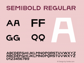
Larish Alteis a pretty accurate digitization and conserves the overall impression of printed Plinius. A direct comparison reveals that the uppercase is less tall and descenders were shortened. Some details were sharpened, others removed. These deviations might have to do with the different intended design size: while Plinius is a text face, Larish Alte is also used for display purposes. Like the metal model, the new typeface comes in a single — semibold — weight only. Years later, OpenType features were added, defining two different looks of Larish Alte. A monocular 'a', an 'A' with head serifs, and a straight-sided 'y' are offered as alternates.

In the identity, Larish Alte is often used in place of graphic elements, in an ornamental way that is not primarily concerned with readability.

A purely typographic poster, with tough-minded hyphenation. The artist's work is printed on the backside and shows through the very thin paper.
After finishing the work on Larish Alte for the Vienna Secession, Radim Peško returned to the rejected drafts:
Larish Neue is a by-product of Larish Alte. Based on entirely different construction principles, this version resulted from an attempt to create a contemporary looking typeface with the DNA of the original.
The resulting Larish Neue is a strong, rugged typeface in two styles, Roman and Italic. Its ancestor shines through in some details, but only on second glance.

Larish Alte (left) vs. Larish Neue (right)
After only two years the Vienna Secession changed its corporate design again and returned to another Helvetica-based design. Radim Peško revised the fonts and made both Larish Alte and Neue available for public licensing from his RP Digital Type Foundry in 2011.
contributing a variety of interesting Uses to our Collection. This is his first to appear in the Blog.


-
 Cangji Fonts
Brand: 仓迹字库
Area: China

-
 JT Foundry
Brand: 翰字铸造
Area: Taiwan, China

-
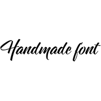 Handmadefont
Brand:
Area: Estonia

-
·千图字体
-
 HyFont Studio
Brand: 新美字库
Area: China
-
 Minrui Type
Brand: 敏锐字库
Area: China


- ·The Future of Sex poster
- ·How to sell your typefaces
- ·"Fantastic!" ad for Captain Fantastic & the Brown Dirt Cowboy by Elton John & Bernie Taupin
- ·Benetton identity redesign
- ·Brother Moto Flat-Trackin' Tee
- ·Why Apple Abandoned the World's Most Beloved Typeface?
- ·Sinnesreize / Embracing Sensation by Silvia Gertsch and Xerxes Ach
- ·Antropofagia. Palimpsesto Selvagem
- ·Cocoa Marsh Instant Fudge Candy Mix packaging
- ·Ad for Vincebus Eruptum by Blue Cheer