The Pattern Project
Basically, two things came together. First: I am fascinated by the mesmerizing richness of detail in medieval initials. And I admire the patience and drawing skills those medieval monks possessed – perhaps because I actually lack both. In the Middle Ages the more detailed and elaborate the decoration was, the higher the value and appreciation of the item. But it was not only about showing off or communicating relevance. Decoration also had another function: manuscripts were often structured by clever hierarchies of initials, similar to what we achieve today with headlines, varying font weights, use of white space, and so on. It simplified navigating through your frequently read book of hours, for example. And that got me to wondering about how contemporary initials could look. How to transform this richness of detail into forms that might appeal to modern-day eyes? But since I am not particularly good at repetitive tasks, I never really got any further than wondering.
Second: In 2006/07 while studying Type & Media in The Hague, like any other typemedia student, I was exposed to the basics of programming. This is mostly geared toward font production, but if you like scripting, you have the opportunity to experiment and play around. So, for practice, I set up a small script with a database of letters built of parts of circles and straight lines that would draw and output striped letters. Than I experimented with various numbers of stripes and moiré effects.
It soon struck me, that this setup was quite powerful. In contrast to Bézier curves, the database allowed me to precisely address every point on the contours and within the letters. Thus, instead of only drawing stripes, I could draw all sorts of patterns into the forms with an almost unlimited amount of detail. And, theoretically, this would not require much effort and time, since I would not have to draw the shapes by hand. In reality, that was something of a miscalculation. In the end it took a lot of effort and about seven years to finish.
Rufillus, 12th century & Eike Dingler, 2014 Computational Type Design
'Type Design by numbers', as John Maeda might call it, is very different from drawing shapes by hand or mouse. I set up a database of letters where each letter was composed of parts of circles and straight lines. I didn't draw any of the shapes but wrote the coordinates (e.g. of the middle point and the radius) into a script. This procedure changes the design process completely: I typed, pressed "run", then let the computer draw a letter, then looked at the results – or, more often looked at error messages and started over. This changes the process of designing. For example, you don't have to be concerned about throwing out basic design decisions late in the process, as you might if drawing manually; e.g., whether the pattern should be squares or triangles you can still play around with that in the end – while when drawing by hand you would decide on that right from the outset, before fine tuning hundreds of letters and thousands of shapes manually. But you have to make sure that your code structure allows for all unforeseen peculiarities (e.g. of varying patterns) and adapt nicely to them. This changes the way you think about your design to a very structural and generic design logic.
And things got complex pretty quickly. In order to cope with the various needs of different patterns, I included over 40 variables in the database. These permit altering the lengths of strokes, overshoot, stroke connections, the height of middle bars, and much more. Add the general formal complexity of A-Z, 0-9, punctuation, and all the other glyphs for a serious character set, the limitations of constructing shapes from parts of circles and straight lines only, the lack of contrast, two masters for interpolation (light & bold), the nine patterns I designed, and you might get an idea of what I had gotten myself into. Changing something to fix a problem with, for example, a specific pattern had to be checked or thought through with all the effects it could have on other possible settings, combinations, letters, weights, etc. The meditative life of monks sitting in scriptoriums and drawing by hand was becoming increasingly more appealing.
Generative Type Design: lettershapes + patterns = pattern fonts 9 Patterns, 34 Styles
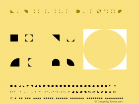
After a lot of experimenting and testing with various patterns, I put together the "Basic Collection." It comprises nine geometric patterns based on rectangles (Pattern No. 1–3), rhombi (◊) (Pattern No. 4–6), and triangles (Pattern No. 7–9). Inspiration for ornament and pattern came from various sources; for example, I looked at the great graphic work of Victor Vasarely, wonderful Islamic Art, or the fantastic tiled floors in the "Neues Museum" in Berlin. Each pattern comes in varying weights or pattern resolutions. As with pattern in general it is quite essential, how far you zoom in – and by varying the font size or pattern resolution, you end up with very different graphic impressions.
The letters of the Basic Collection combine the joy of ornament with the straightness of contemporary geometrical forms and letter shapes. And, although they all share the same skeleton, owing to the different patterns, they all look surprisingly different. And they are all "pure" display typefaces: They are, of course, not suitable at small sizes; but designed to have a distinct graphic impact in large display typography.
All thirty-four styles. Pattern Type App
To meet the conceptual possibilities of exploring a generative type-family, together with TinkaTinka I built the Pattern Type App based on my letter database. This iOS app allows you to easily design and generate pattern fonts on your own according to your individual needs and gusto. Of course it was impossible to include the complexity of possibilities to influence details as I had with the original script. But you are able to adjust the weight, choose the grid resolution for drawing your patterns and change between vertical and horizontal stress of stroke connections. The app opens up type design to graphic designers and non-designers alike. And it's fun.
Pattern No. 3 Fine Bold
Letters Generated with the Pattern Type App
Eike Dingler studied graphic design in Düsseldorf and Arnhem, type design in The Hague, worked for Typotheque, and runs a graphic design practice in Berlin. He founded Mauve Type in 2014 and plans to concentrate on True Display Fonts. In May, 2015, Erik presented the Pattern Project in a talk at TYPO Berlin, titled, "Medieval detail in contemporary display typography."
-
 Cangji Fonts
Brand: 仓迹字库
Area: China

-
 JT Foundry
Brand: 翰字铸造
Area: Taiwan, China

-
 Handmadefont
Brand:
Area: Estonia

-
·千图字体
-
 HyFont Studio
Brand: 新美字库
Area: China

-
 Minrui Type
Brand: 敏锐字库
Area: China

- ·Moving Hands (Helena Hauff Remix) by The Klinik, official video
- ·Benetton identity redesign
- ·How House Industries Designs Its Retrotastic Logos and Typefaces
- ·Hollywood Star Matt Damon Wrote Better Chinese than Chinese Stars
- ·Jim Nutt: Coming Into Character at Museum of Contemporary Art Chicago
- ·Brother Moto Flat-Trackin' Tee
- ·10 Top Romantic Fonts on Valentine's Day!
- ·Ad for Hello Dummy! by Don Rickles
- ·Sinnesreize / Embracing Sensation by Silvia Gertsch and Xerxes Ach
- ·The Form Book by Borries Schwesinger


