


Superfunk


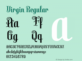
Virgin. License: All Rights Reserved.
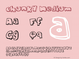
Granitestarted life as custom lettering for volumes 1 and 2 of Superfunk, part of the series of the … album in the world, ever! compilations. Being a funk album, it had an (Black) American focus, which we wanted to show in its packaging. To reflect funk music's sense of edgy cool the cover photography implied 70s Black Power protest imagery. The custom drawn lettering similarly implied the Lou Dorfsman and Herb Lubalin-derived advertising typography of the era — bold, impactful, headline-graphic and tightly set. Chunky slab serifs felt appropriately newsy-retro, the thin hairlines gave the type a use-big headline emphasis, the geometry and grid structure of its drawing gave it a 90s zeitgeisty modular modernity.
Between the first and second albums the typeface was redrawn and its shape rounded for the version to be released. Note differences in particular in the 'a' and 'g' characters.

Virgin. License: All Rights Reserved.

Virgin. License: All Rights Reserved.

Virgin. License: All Rights Reserved.

Virgin. License: All Rights Reserved.


-
 Cangji Fonts
Brand: 仓迹字库
Area: China

-
 JT Foundry
Brand: 翰字铸造
Area: Taiwan, China

-
 Handmadefont
Brand:
Area: Estonia

-
·千图字体
-
 HyFont Studio
Brand: 新美字库
Area: China
-
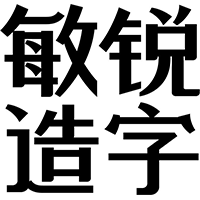 Minrui Type
Brand: 敏锐字库
Area: China


- ·Once Upon DESIGN: New Routes for Arabian Heritage
- ·Ad for Hello Dummy! by Don Rickles
- ·Statement and Counter-Statement, Automatically Arranged Alphabets, and Arts/Rats/Star
- ·Jim Nutt: Coming Into Character at Museum of Contemporary Art Chicago
- ·20 Houses. A New Residential Landscape exhibition, Wallpaper* Architects Directory
- ·Cocoa Marsh Instant Fudge Candy Mix packaging
- ·Surabaya Beat by Beat Presser, Afterhours Books
- ·Top 100 Fonts.com Web Fonts for May 2016
- ·Amazon Releases Ember Bold Font for the Kindle
- ·Linotype Ad: "Linotype vs. Intertype"