


Shady Characters Shines Bright

Before I dive into my review for Shady Characters: Ampersands, Interrobangs and other Typographical Curiosities (The Secret Life of Punctuation, Symbols, and Other Typographical Marks is the slightly more prosaic tagline for the American edition) I would like to explain something. You may have noticed that – even though I sometimes may have some criticism – usually my book reviews are positive. The reason for this is quite simple: I like to devote my time and effort to worthwhile things. This makes me less inclined to start reading books that I am not very interested in, or when I have my doubts that I will enjoy them. To be completely honest I did once stop reading a book and then decided to not review it. I had bought it out of sheer vanity because I noticed my name in the 'thank you's at the back. Unfortunately it turned out to be a rather disappointing read. Shady Characters however is not – it simply is a delightful book.
Table of contents
Late September Shady Characters, the blog, spawned the hardcover companion Shady Characters, the book. Their author Keith Houston "writes medical visualization software but by night he cycles, plays bass and writes about punctuation." Keith "started writing on this subject back in 2008 at the suggestion of a friend and over the course of the next two years he finished rough essays on a variety of different marks." The basic premise of his new book sounds suitably geeky, and I kind of expected to have to work my way through something akin to a university thesis or an academic exploration. My expectations could not have been more wrong. Although there is indeed a certain level geekiness to the book, it reads like an engrossing work of non-fiction, and at times almost like a detective novel. What amazed me most is how Keith – who calls himself "a complete amateur in the worlds of punctuation and typography" – managed to write such a comprehensive book of such factual accuracy, extensively referenced and annotated, while still keeping it an effortless yet consistent read.
Opening page for Chapter 5 – The @ Symbol
The book can be read in different ways, both equally enjoyable. On the train ride back from the ATypI conference in Amsterdam I devoured the first seven chapters in one sitting, while the remaining three chapters were savoured one by one. Keith has a marvelous way of setting up those chapters with introductory paragraphs that set the scene, cleverly hinting at what will unfold in the following pages. This whets the appetite of the reader for things to come. Before you realise it you are pulled into the story. Like a skilled, knowledgeable guide Keith takes the reader on a journey of discovery, tracing the origins of certain typographical marks back to the dawn of Greek and Roman civilisation. He moves back and forth in time, making stops at all the important stages in the history of communication – illuminated manuscripts, the birth of moveable type, all the different types of printing, the development of the telephone, the computer, the internet, … Whereas Simon Garfield does so with the nervousness of a squirrel with ADHD revved up on energy drinks in his Just My Type, Keith Houston displays a clear sense of purpose and determination, guiding the reader from one surprising fact to the next delicious morsel of information. Although he remains firmly focused on the marks the book is all about, he doesn't hesitate to sidestep and pepper his stories with interesting and often amusing historical, political and sociological context. Ultimately, Shady Characters is about more, so much more than just the origin and evolution of these obscure signs that punctuate the page or the screen. It is also a fascinating examination of language, of communication, of technology, and by extension of culture and human society.
Daggers and double daggers
Just like Stephen Coles' reference work The Anatomy of Type / The Geometry of Type, Shady Characters comes in two versions with different titles and different cover designs, one for the American market, and one for the European. I was very happy to get the latter, because the elegant (and clever) design by Matthew Young is gorgeous. The black P22 Underground characters combined with the big red punctuation marks and the tagline in italic Hoefler Text, pressed into the uncoated stock, lend the dust cover a wonderful tactile quality. The design is an extension of the inside pages which are exquisitely designed by Judith Abbate. Text is also set in Hoefler Text, with drop caps, asterisks and daggers, ornaments, rules and other assorted details tastefully printed in red. The book is extensively annotated and indexed, making it a valuable resource as well.
The American cover for W.W.Norton by Jason Booher
Now you probably think "This is impossible, such a glowing review". Well, to accommodate the cynics I do have one – albeit tiny – point of criticism regarding the reproduction of the black and white photographs. Technically there is nothing wrong with them, yet sometimes it is difficult to locate the specific elements they need to illustrate amongst the often very small characters (I did manage eventually). This poses a dilemma. Are you supposed to be absolutely truthful when reproducing documents in a book? Are you allowed to forgo authenticity and improve their intelligibility by – for example – increasing the contrast or highlighting the relevant element(s) using the second colour red used throughout the book? My background as a magazine and information designer suggests to favour the latter.
Index – Key to symbols
I am impressed at how Keith Houston manages to strike the perfect balance between the academic and the popular. On the one hand the content is sufficiently specialised to make the book a valuable addition to the library of any typographer, graphic designer or other type enthusiast. On the other hand his knowledgeable and entertaining writing style makes it accessible to anyone even casually interested in writing and communication, without dumbing down the content in the least.
Finally I would like to start adding a new criterion to my book reviews – Megan Quill's Chuckle Coefficient. I have noticed that my partner and love-of-my-life Megan is an expert at judging my enjoyment of a book by pointing out how often I chuckle (or groan). In the chapter about the ampersand I even ended up in tears of laughter reading out loud to her the list starting with "and-pussy-and" and ending with "zumzy-zan". The number of times she smiled and asked me "What are you giggling about now?" confirms my verdict that the delightful Shady Characters: Ampersands, Interrobangs and other Typographical Curiosities is absolutely recommended.
All images from W.W.Norton & Company, Inc., independent publishers since 1923.
Header image:Opening a box of European editions, by Keith Houston


-
 Cangji Fonts
Brand: 仓迹字库
Area: China

-
 JT Foundry
Brand: 翰字铸造
Area: Taiwan, China

-
 Handmadefont
Brand:
Area: Estonia

-
·千图字体
-
 HyFont Studio
Brand: 新美字库
Area: China
-
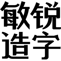 Minrui Type
Brand: 敏锐字库
Area: China


- ·Barbe à papa Cotton Candy
- ·Alphabet Stories by Hermann Zapf
- ·"Jesus Music" ad for Myrrh Records
- ·XUID Arrays: One Less Thing To Worry About
- ·How to Read a Painting by Patrick de Rynck
- ·"Fantastic!" ad for Captain Fantastic & the Brown Dirt Cowboy by Elton John & Bernie Taupin
- ·Japanese Typography Writing System
- ·He Invented a Font to Help People With Dyslexia Read
- ·Food Not Bombs hypothetical redesign
- ·Cher Got Sued For Font!