


Winners of The Worldwide Logo Design Annual Announced

Wolda announced the publication of its inaugural 2008 printed annual. Built on the success of Eulda, the European Logo Design Annual (which it has replaced), Wolda is the high-profile graphic design award scheme that rewards the best logos and trademarks designed throughout the world. The winners are selected by an international three-tier jury consisting of 10 top design professionals, 10 marketing managers from major international clients, and finally 10 members of the public (provided respectively by the worldwide organizations Icograda, Aquent and Consumers International).
The judges determine the winning entries according to the following criteria: clear communication of message, originality and creativity, good graphic design, and positive overall impression.
Flow| Vibration based mineral water brand.
Designed by Danny Goldberg Design (Israel)
Alex Schrijvers| This Belgian handbag designer creates exquisite leather bags in an 'alternative chic' style.
Designed by Davy Dooms (Belgium)
PDFs of the Wolda '08 winners can be seen in the Showcase section, and downloaded in the Press Area. The Best of Nation PDF showcases the 52 winners worldwide. While some of them feature the usual suspects in choice of type – VAG Rounded for childcare product retail store Babyfirst is to be expected – there are a couple that use less obvious choices.
The annual itself is set in Lukasz Dziedzic's FF Clan and FF Cocon by Evert Bloemsma.
Toko| Shops with prestigious baggage accessories with a lasting tradition.
Designed by Teja Kleč, Darko Miladinović (Armada, Slovenia)
Typeface: Auto 3 Italic
Be| London based events company specialising in live music and club events in unique locations.
Designed by Rob Gonzalez, Jonathan Quainton (Sawdust, United Kingdom)
With Wolda Talent, the competition is now open to students too, for logos designed in schools and universities, including logos never used publicly. After screening by the Wolda editorial team, the selected logos then proceed to the jury selection process, where they are be judged in the same way as the professional logos. The winning logos will be published in a dedicated section of the Wolda annual.
Happy Monster| Fruit flavored gum, packaged in cute boxes, designed to look like monsters.
Designed by Andrew Zelman (United States of America)
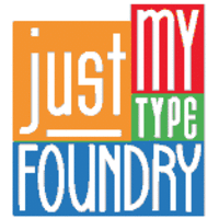
Just My Type| Unifying mark across a range of four valentine's day cards designed for graphic designers, specifically those who love type.
Designed by Adam Ding, Ben Brears (United Kingdom)
Typeface: ITC Bookman Italic Swashes
Best of Continent
Not only does Wolda elect a best logo for each country, but there are also six continent winners amongst them. I featured them in the header, but thought I might give them equal treatment to the more typographic ones I showcase in this post. It seems only right, because, you know, they are the best of their continent! Like, humongous land mass and stuff! :)
Wolda Professional awards | Best of Oceania |Best of the World
One Degree| In 2007, Rupert Murdoch laid down the challenge for News Limited and its associated global businesses to become carbon neutral by 2010. The challenge was to create a brand that would materially help drive employee, supplier and public action on climate change. One Degree has been developed on a simple premise: that if everyone were to change their behaviour by just one degree, we can change the future of the planet. The logo combines both the number and the degree symbol, which together represent a person. In doing so, it neatly encapsulates the real impact that an individual can start to make in addressing climate change.
Designed by Jason Little, Tim Warren, Steve Clarke, Mike Staniford (Landor Associates, Australia)
Typeface:(similar in style and concept) FF Netto
Wolda Professional awards |Best of Asia
Neo Tokyo| An exhibition of contemporary Japanese electronic art.
Designed by David Williams, Siripong Wongjinda, Pasu Kongprasertkit, Teerayuth Leetrakul (Digital ZOO, Thailand)
Wolda Professional awards |Best of Europe
Sancti Spíritus Wines | Logo for La Repostería de las Monjas
Designed by Álvaro Pérez (El Paso, Galería de Comunicación, Spain)
Typeface:Walbaum
Wolda Professional awards |Best of Americas
Sapka| Sapka means "hat" in Turkish. Logo and identity design for a vintage style hat designer.
Designed by Neue Helvetica 35 Thin
Wolda Professional awards |Best of Africa
SoulStice| Day spa, with architecture featuring good use of natural light and a solarium at its centre.
Designed by Bronwen Rautenbach, Kyle Wilhelm (The Brand Union, Johannesburg, South Africa)
Typeface:Horatio
Wolda Talent awards | Best of Europe |Best of the World
Super Kraft| Japanese music label
Designed by Daniel A. Becker (Germany)


-
 Cangji Fonts
Brand: 仓迹字库
Area: China

-
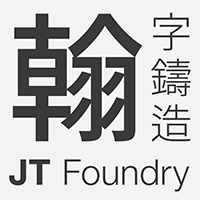 JT Foundry
Brand: 翰字铸造
Area: Taiwan, China

-
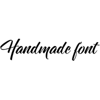 Handmadefont
Brand:
Area: Estonia

-
·千图字体
-
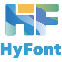 HyFont Studio
Brand: 新美字库
Area: China
-
 Minrui Type
Brand: 敏锐字库
Area: China


- ·Hollywood Star Matt Damon Wrote Better Chinese than Chinese Stars
- ·Surabaya Beat by Beat Presser, Afterhours Books
- ·Quimbaya Coffee Roasters
- ·Jim Nutt: Coming Into Character at Museum of Contemporary Art Chicago
- ·Statement and Counter-Statement, Automatically Arranged Alphabets, and Arts/Rats/Star
- ·Königsblut identity
- ·20 Houses. A New Residential Landscape exhibition, Wallpaper* Architects Directory
- ·Sinnesreize / Embracing Sensation by Silvia Gertsch and Xerxes Ach
- ·Iconic Transport for London logo undergoes subtle redesign
- ·How to Read a Painting by Patrick de Rynck