


Notes on the Frankfurt Book Fair
Note from the translator: I'm a little late with this October 16 FontBlog entry for the simple reason that I couldn't get to it before leaving for San Francisco. But as it features some really nice logo work I still wanted to post this on The FontFeed. — Yves
I was at the Frankfurt Book Fair for one and a half day, where I had more discussions than I actually saw books. The host country this year was Turkey. The labyrinth logo was omnipresent. This immediately reminded me of our discussion on Fontblog.de in March last year, when Sandy Kaltenborn was confronted with a legal threat, as his typo-labyrinth on the cover of the G8 brochure Die Deutung der Welt bore too much resemblance to the cover for Adreas Uebele's Orientierungssysteme und Signaletik.
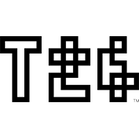
Letters hidden in a labyrinth: T26 type catalogue cover (2000), book cover for "Orientierungssysteme und Signaletik" (October 2006) and cover for the G8 brochure (2007)
China was selected to be the host country of the 2009 book fair. The design of next year's logo and halls was assigned to Germany's most well-known Chinese designer, best-selling author and TYPO presenter Yang Liu (Fontblog on her posters, Fontblog on her book).
Whoever designs the logo for the book fair will see it applied on the most diverse media: carrier bags, catalogue, advertisements, columns, transparancies, floor coverings… I was curious to discover Yang Liu's creation which was unveiled at a press conference on October 16th. Unfortunately I was unable to attend, as I already was making my way back to Berlin. However she revealed to me that it was going to be entirely black-and-white.


-
 Cangji Fonts
Brand: 仓迹字库
Area: China

-
 JT Foundry
Brand: 翰字铸造
Area: Taiwan, China

-
 Handmadefont
Brand:
Area: Estonia

-
·千图字体
-
 HyFont Studio
Brand: 新美字库
Area: China
-
 Minrui Type
Brand: 敏锐字库
Area: China


- ·Statement and Counter-Statement, Automatically Arranged Alphabets, and Arts/Rats/Star
- ·Japanese Typography Writing System
- ·Sinnesreize / Embracing Sensation by Silvia Gertsch and Xerxes Ach
- ·"Jesus Music" ad for Myrrh Records
- ·The Form Book by Borries Schwesinger
- ·Quimbaya Coffee Roasters
- ·Troubadour poster, Opera Plovdiv
- ·Barbe à papa Cotton Candy
- ·Amazon Releases Ember Bold Font for the Kindle
- ·How House Industries Designs Its Retrotastic Logos and Typefaces