


My Type of Music | July 2008
I hate it when this happens. I mean, yes it's good but no it's not good. The album cover for Beck – Modern Guilt is well designed of course, with intriguing black and white photography and clean straightforward typography in Helvetica caps, very much in the International Style. But I'd expect an artist like Beck to be looking forward instead of backwards. Or at least find a contemporary twist to this worn-out style.
Yes, the seventies are back in full force. We noticed the resurgence of typical cheesy seventies display faces since a good while now, and recently more specifically very dark constructed geometric designs like Black Boton, Blocks, Corpulent, Doufff, Unovis, Sinaloa and the likes.
I don't recognize the one on G.Love & Special Sauce – Superhero Brother but I don't think it was such a good idea to extrude the type. The black 3D effect creates an odd interference with the pattern in the green striped version of the face.
Primal Scream – Beautiful Future on the other hand has Milton Glaser's classic Baby Teeth on the cover, another example of that style of display faces. The only digitization I know of is ParaType's Bebit.
Some more seventies nostalgia can be found on Sharleen Spiteri – Melody. Both the image quality of the creased photograph and the colourful type look very authentic. Caslon Graphique is one of those typical fat faces (high-contrast very bold serif faces) that were frequently used for headlines in seventies magazines and ads. My partner in font geekery Stephen Coles once made this handy list of extra bold, ultra black fonts for The FontFeed.
Another "trend" last month were the condensed grotesques. On Klaus Schulze & Lisa Gerrard – Farscape it's the inescapable Helvetica Condensed. The fact that it's set in spaced caps out makes it look like an eighties design. The ethereal image is captivating.
It's Helvetica Condensed all caps again on Tricky – Knowle West Boy, on what I think is a way too safe album cover for such an adventurous musical talent. Same problem here as with Beck.
And Patti Smith & Kevin Shields – The Coral Sea uses Univers Condensed (Helvetica's grown-up sibling and the true Modernist typeface). The album cover looks like it's for a seventies avant jazz outfit or a contemporary classical ensemble.
Stereo MCs – Double Bubble features a colourful op art graphic which seems to spin, just like a record. Quite appropriate for a hip hop outfit. ;) The type on the orange sticker looks a bit like a modified Aachen or Aldo Novarese's peculiar Colossalis, a slab serif which combines angular cut-off corners on the outside of the character shapes with smooth round ones on the inside.
This is a bit bizarre. For Zack de la Rocha and Jon Theodore's collaborative project One Day As A Lion the archetypical computer font Verdana by living legend Matthew Carter has been cut out and sprayed on the album cover, which makes for an unusual pairing of media. But the end result in black and white with cyan type looks convincing.
Ah, the wondrous Carla Bruni. Even after becoming France's first lady she still finds the time to record a new album. I wonder if her new position (no pun intended ;) helps her further her musical career, or is that just me being sarcastic?
Comme si de rien n'était betrays that Carla – being an ex-model – still has her connections in the photography world and knows a thing or two about how to present herself. The image is flawless, so having only her name in lowercase in a skinny weight of H&FJ Gotham grace the cover is an understandable design option.
I love this one. Randy Newman – Harps And Angels nicely references classic jazz album covers. The subdued colour scheme of the image is gorgeous, and the setting is really witty, with Randy Newman in a tuxedo playing the keyboard in front of a row of mopeds. This perfectly reflects the humoristic and slightly leftfield atmosphere of Newman's songs. The type fits perfectly; all caps Stymie Black for the artist's name and a very nice surprise for the album title. Volta is a lesser known slab serif somewhat similar to Clarendon and Egizio/Belizio but wider and with a distinct vintage feel to it. And will you look at that delightful slanted roman… it sure hits all the right spots.


-
 Cangji Fonts
Brand: 仓迹字库
Area: China

-
 JT Foundry
Brand: 翰字铸造
Area: Taiwan, China

-
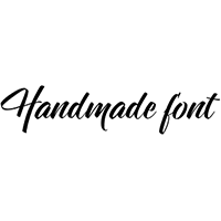 Handmadefont
Brand:
Area: Estonia

-
·千图字体
-
 HyFont Studio
Brand: 新美字库
Area: China
-
 Minrui Type
Brand: 敏锐字库
Area: China


- ·10 Top Romantic Fonts on Valentine's Day!
- ·"Fantastic!" ad for Captain Fantastic & the Brown Dirt Cowboy by Elton John & Bernie Taupin
- ·Quimbaya Coffee Roasters
- ·Cocoa Marsh Instant Fudge Candy Mix packaging
- ·Surabaya Beat by Beat Presser, Afterhours Books
- ·Why Apple Abandoned the World's Most Beloved Typeface?
- ·Food Not Bombs hypothetical redesign
- ·"Die Alpen – Vielfalt in Europa" stamp
- ·Alphabet Stories by Hermann Zapf
- ·Sinnesreize / Embracing Sensation by Silvia Gertsch and Xerxes Ach